Bring It Back’s brand identity blends 70s nostalgia with sustainability. The B-i-B butterfly logo symbolizes transformation, supported by a warm orange-brown palette and playful retro typography. The system is scalable across media, and the social visuals use vintage aesthetics to create a memorable and engaging brand presence.
Bring it Back
Graphic Design
October 14, 2025
For Bring It Back, I created a complete brand identity inspired by 70s aesthetics, focusing on nostalgia, sustainability, and emotional connection. The visual system combines vintage warmth with a modern approach, emphasizing the brand’s mission of giving pre-loved fashion a second life. The identity prioritizes recognizability, playfulness, and the symbolic theme of transformation.
The goal was to develop a distinctive visual identity that:
The brand system was built across several key components:
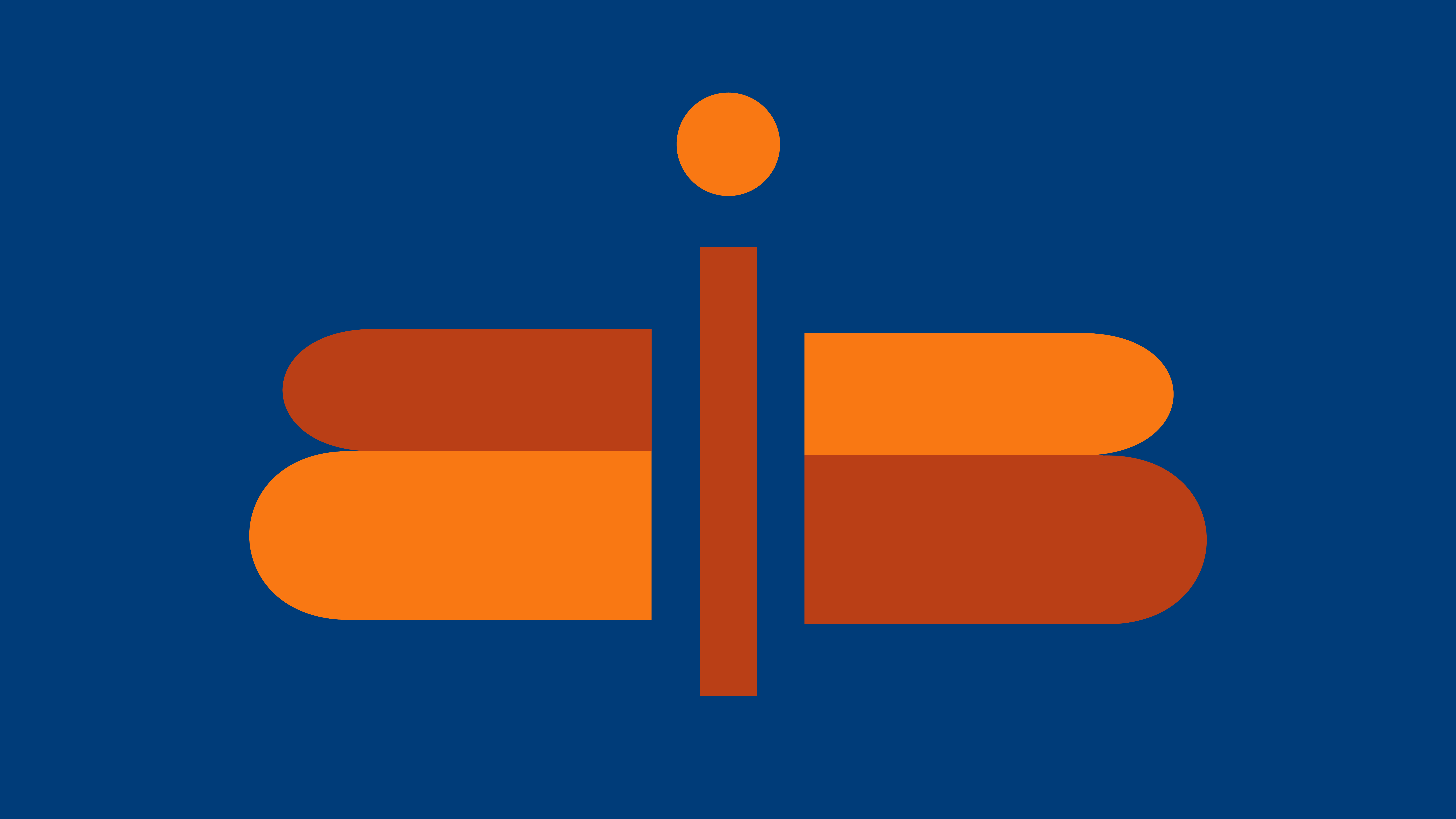
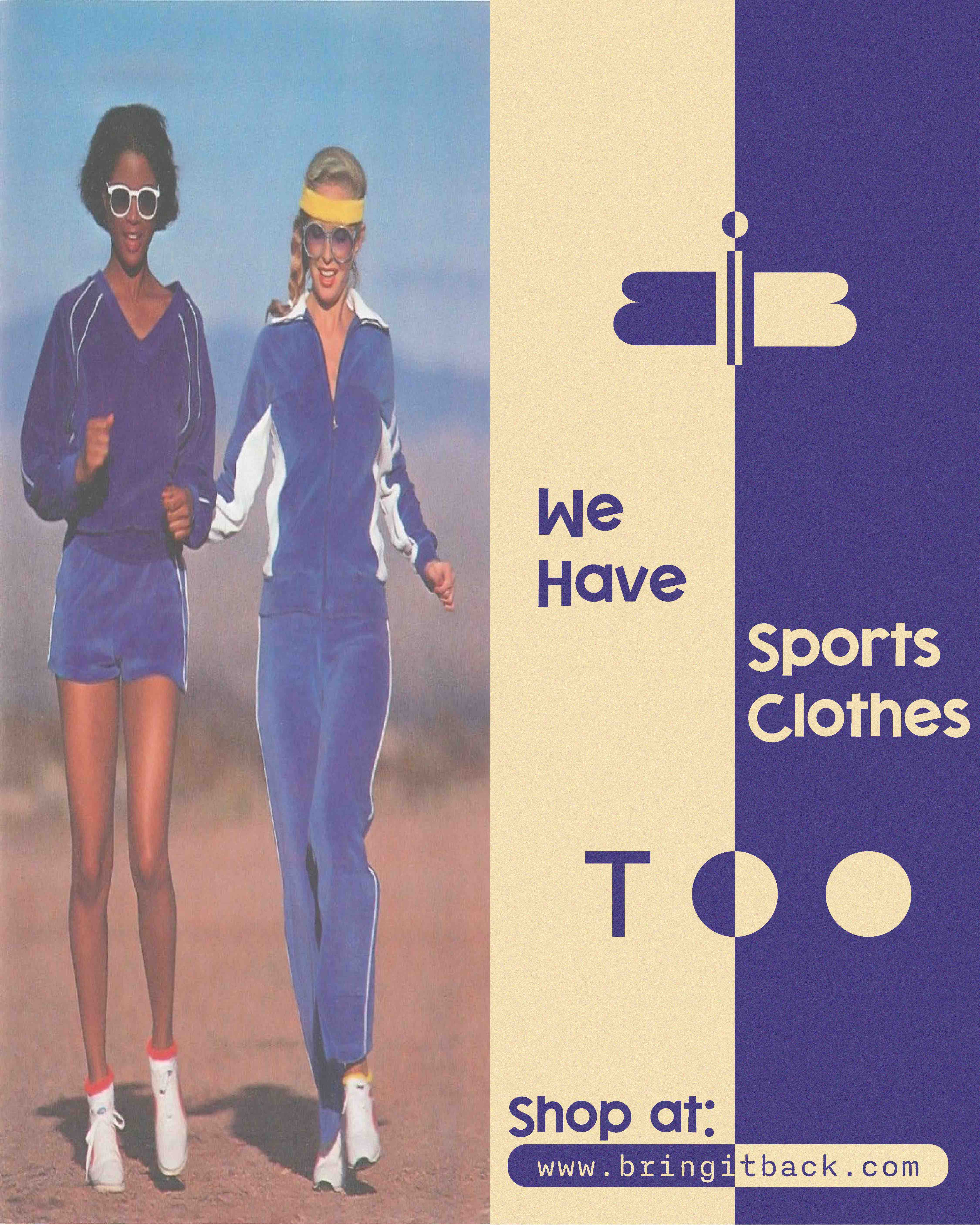
The logo incorporates the letters B, i, and B to form both the brand initials and a stylized butterfly.
The butterfly symbolizes metamorphosis—a direct reference to how vintage clothing is revived and how the customer experience transforms through discovery and reuse.
The palette draws from classic 1970s tones, primarily:
These warm, earthy colors were iconic during the era and reinforce the brand’s identity. They also communicate environmental consciousness, warmth, and trust, supporting the brand’s positioning as sustainable and friendly.
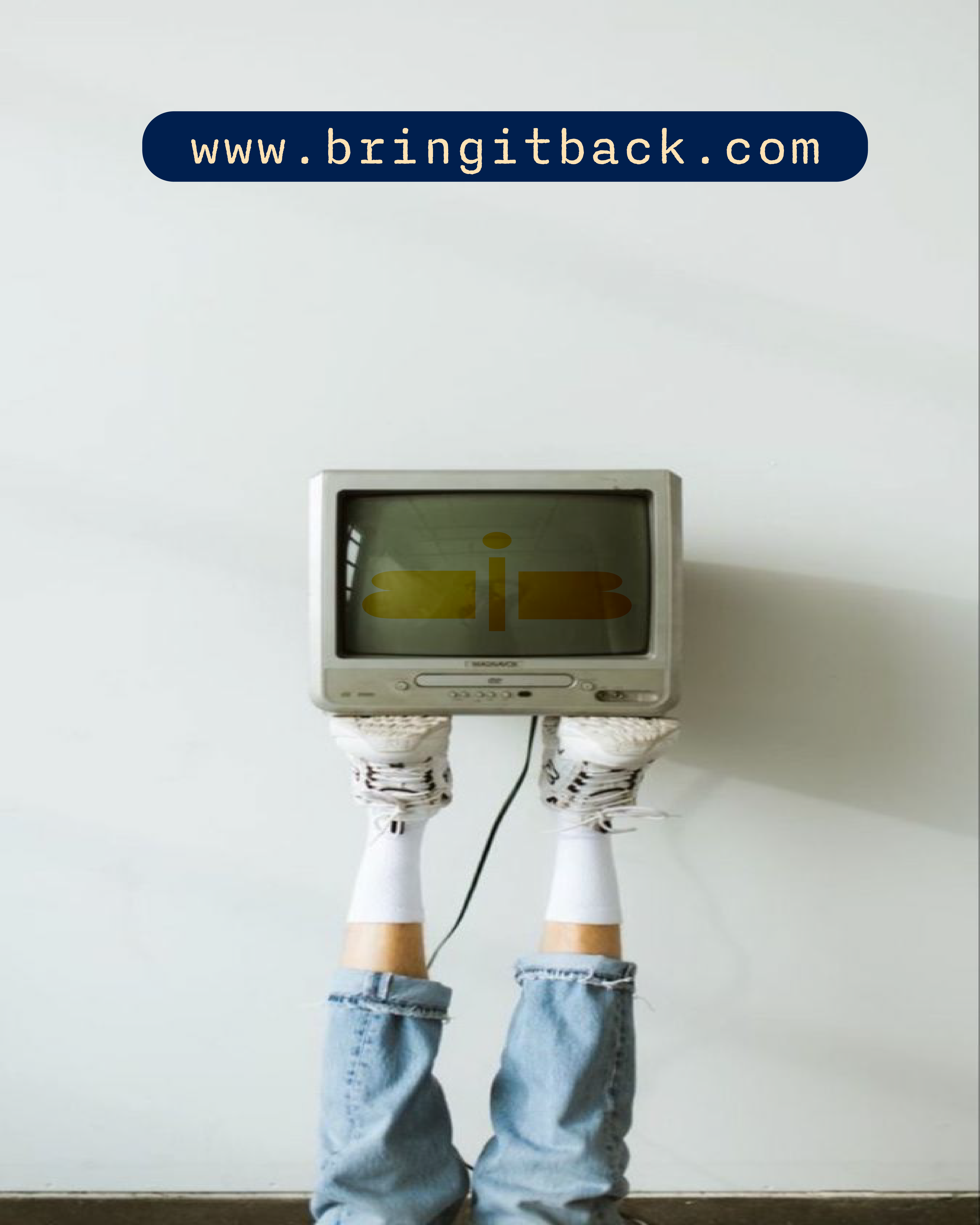
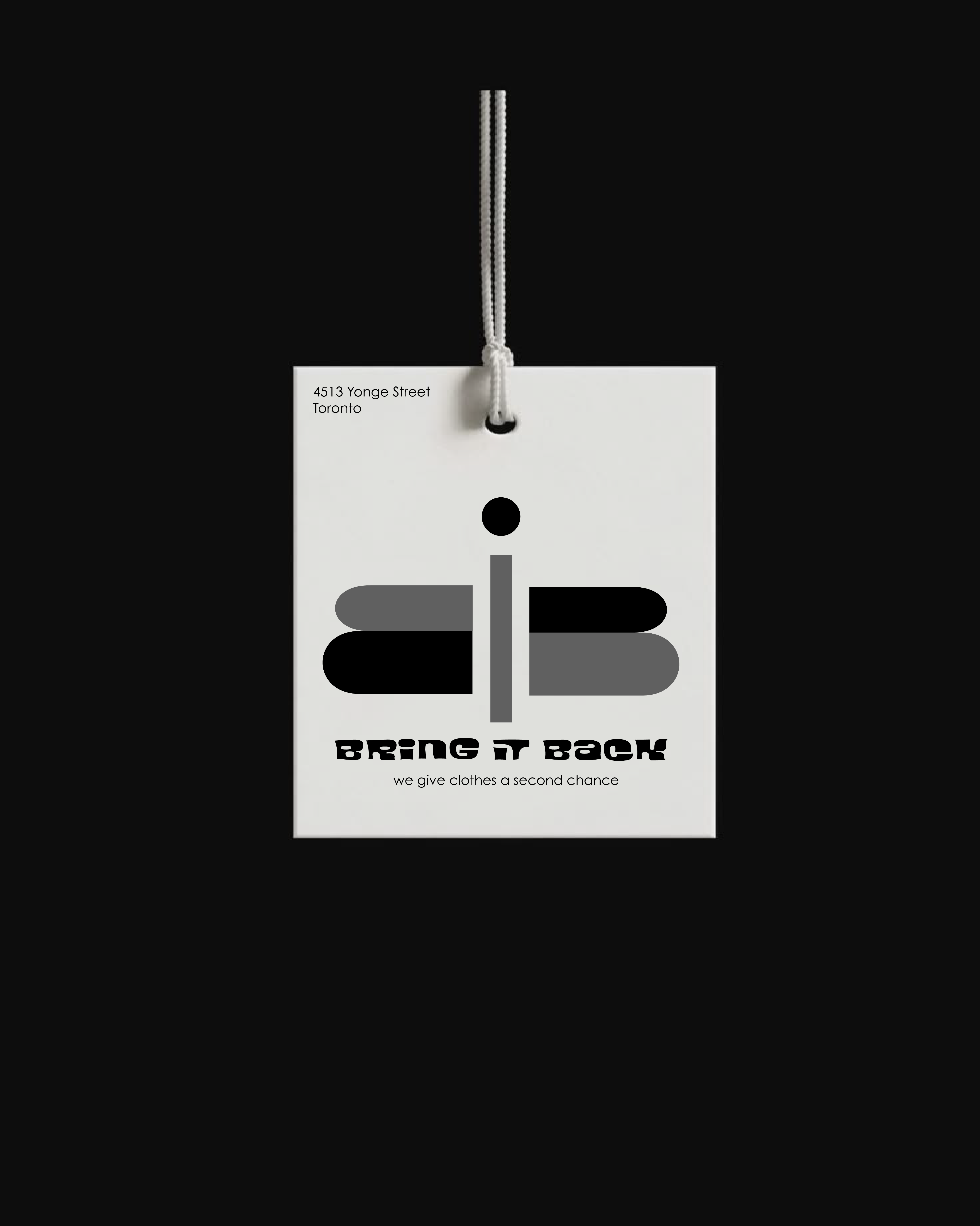
The mockups demonstrate that both the logo and typography are scalable, recognizable, and visually adaptable across product tags, packaging, posters, and digital media.
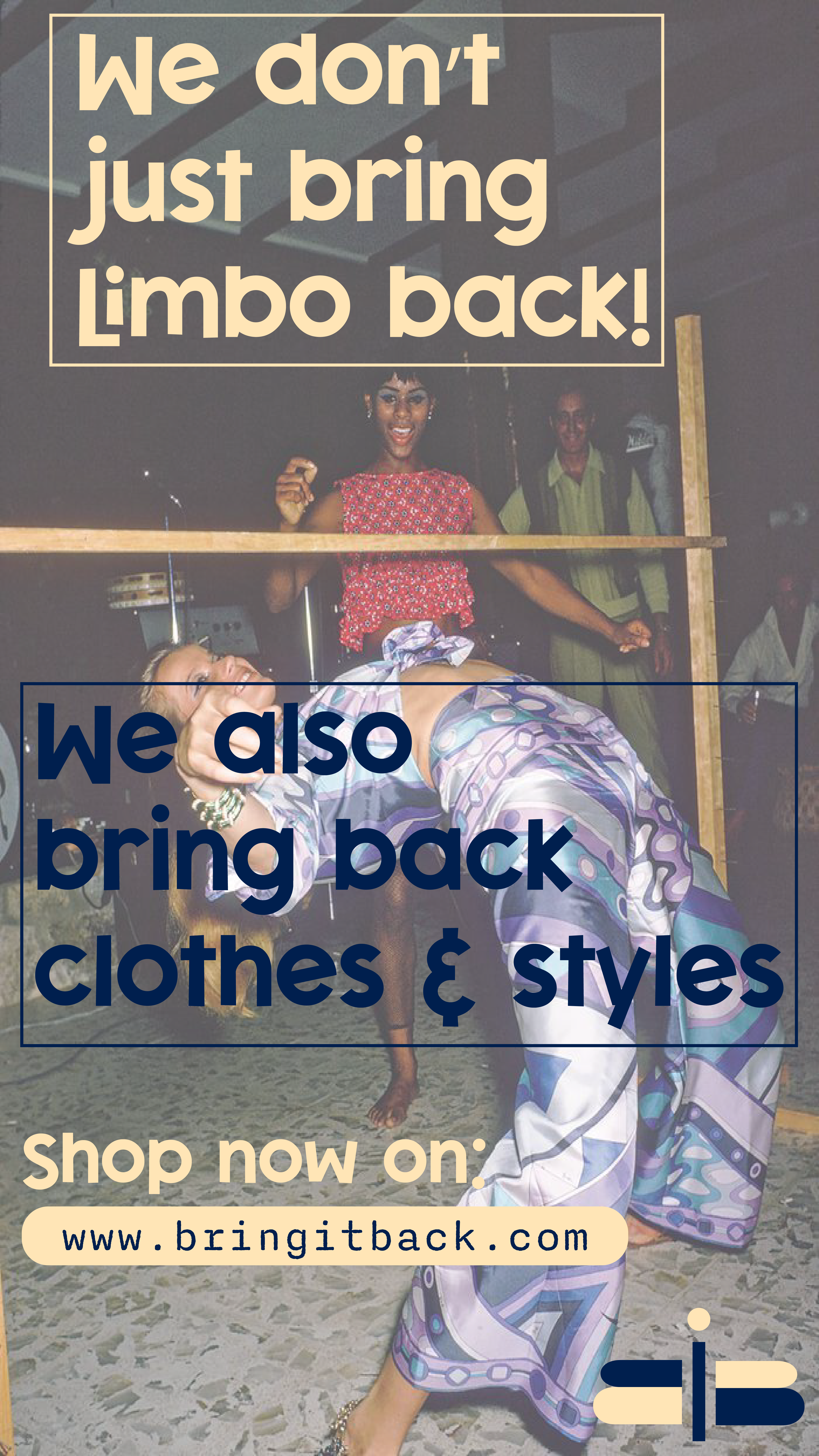
Bring It Back’s social presence uses 1970s-inspired imagery and layouts, creating a strong, cohesive visual identity. The posts resemble vintage ads while avoiding an outdated feel, achieving a balance between:
The result is a memorable, engaging brand language that resonates with an audience drawn to sustainability, nostalgia, and fashion.


A good design can never become obsolete.
© 2025 Puls Design. All Rights Reserved.
Built By
Philip Puls