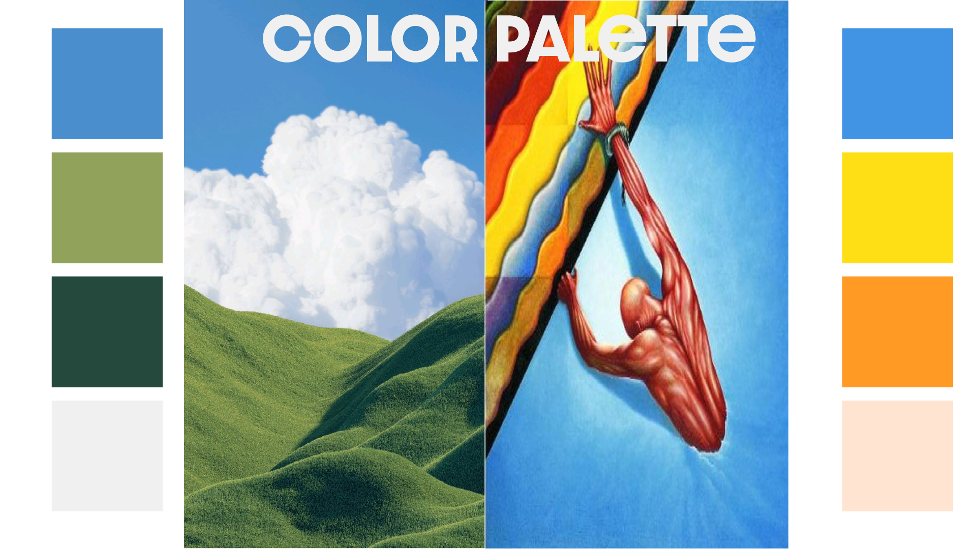
I built Clarity Cost’s visual identity from the ground up using my 4-step design process from developing the logo, color palette, and typography. The final system blends clarity and trust through clean design and a modern blue-green-white palette.
Clarity Cost
Branding
December 8, 2024

For Clarity Cost, I defined the company’s brand identity entirely from the ground up, implementing my 4-step Problem-Solving Design Cycle throughout the process. The goal was to create a modern, trustworthy, and functional visual language that reflected the company’s dual focus on financial consulting and marketing strategy.
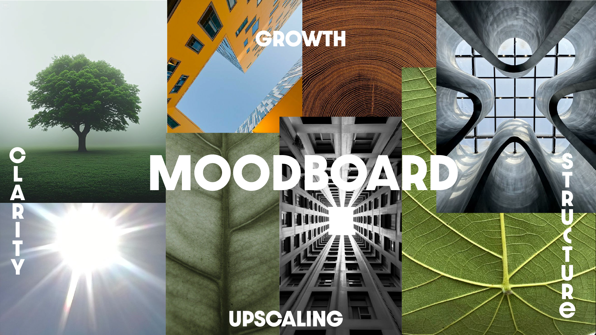
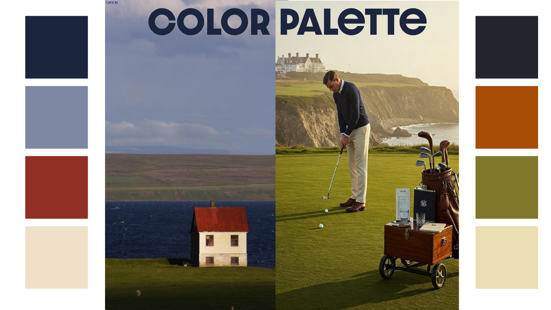
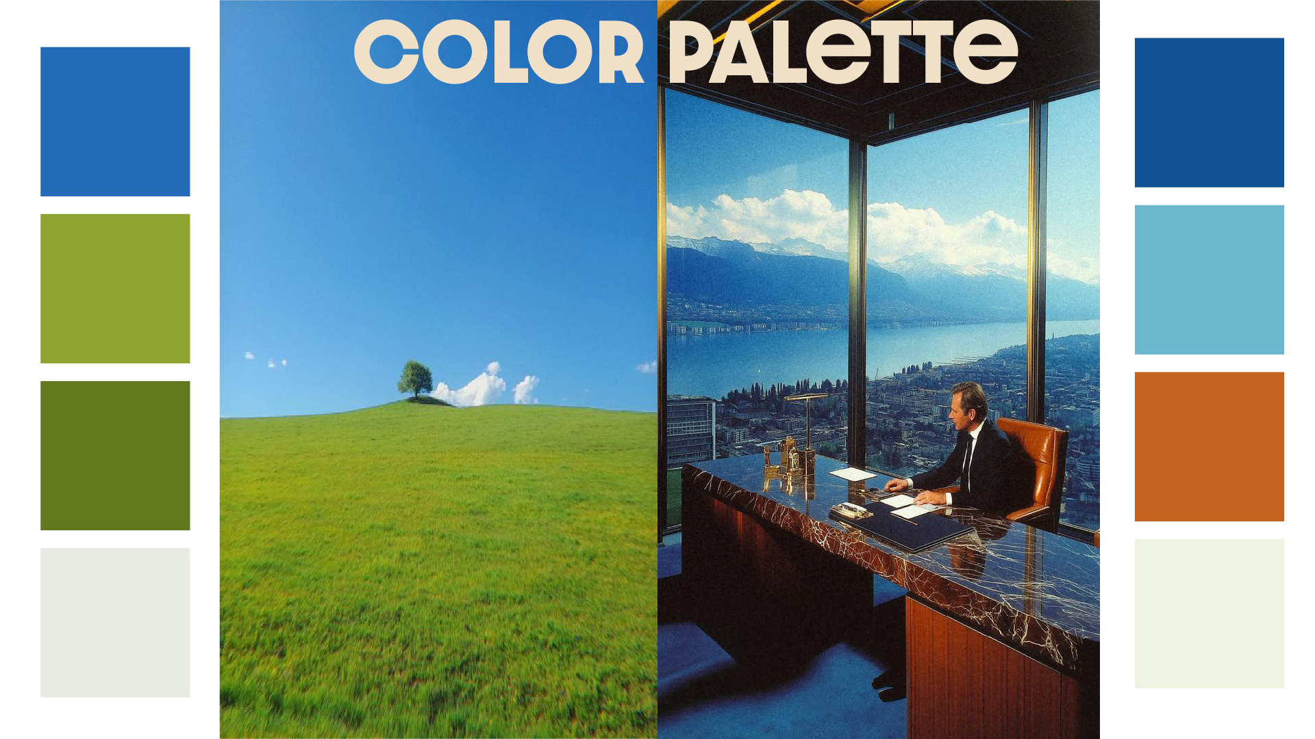
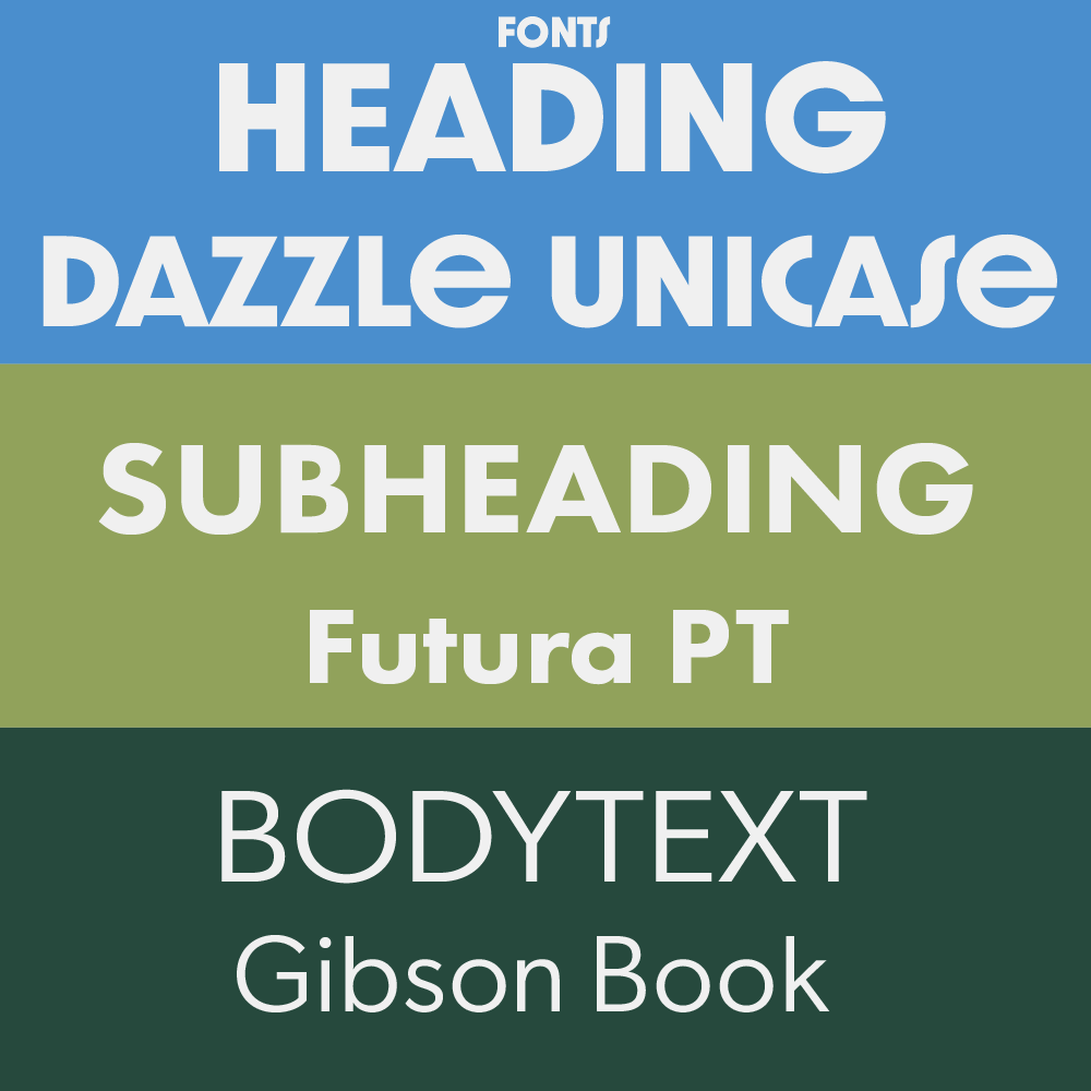
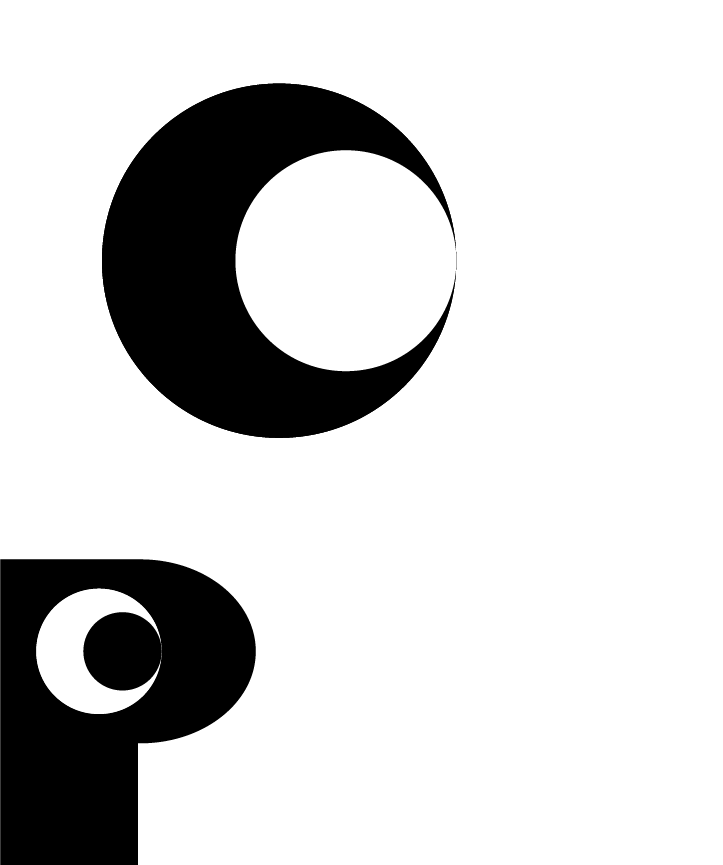
The foundation began with a comprehensive moodboard that established the visual tone, followed by color palette development, font selection, and the design of a distinct logo system.
The main objective was to give Clarity Cost a clear and consistent brand identity that visually communicates its professionalism, reliability, and innovative thinking.Through color, typography, and form, the design aimed to:
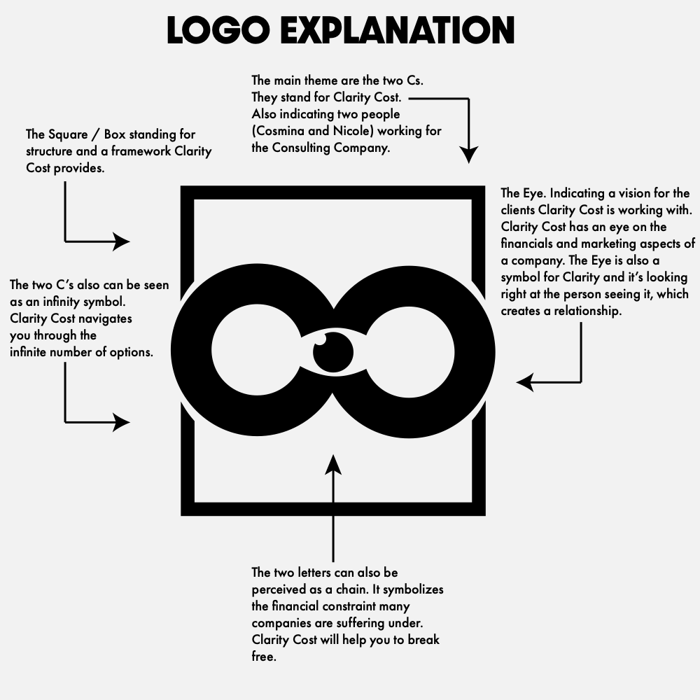
The design process included the following deliverables:
This cohesive system allowed Clarity Cost to present itself with confidence, consistency, and a clear visual identity that resonates with its audience.
A good aesthetic can never become obsolete.
©© 2024 Puls Design. All Rights Reserved.
Built By
Philip Puls