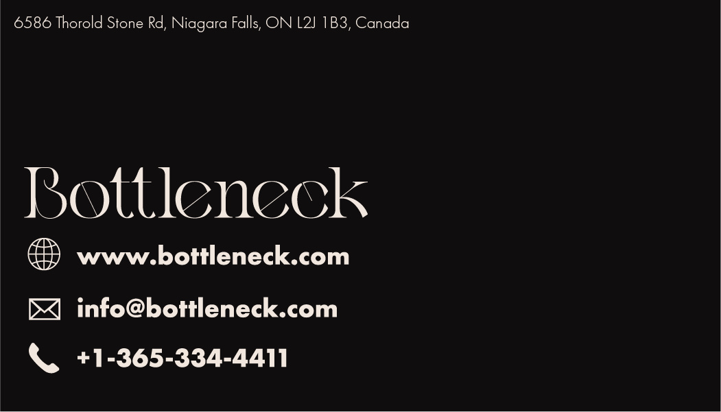
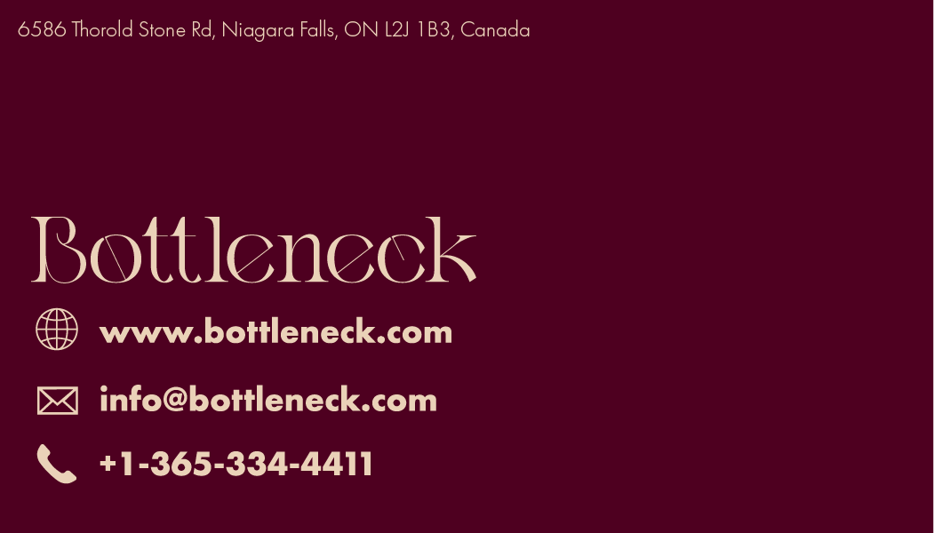
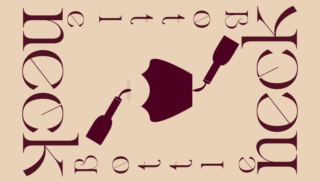
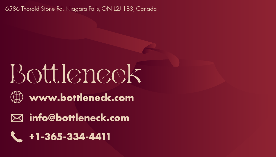
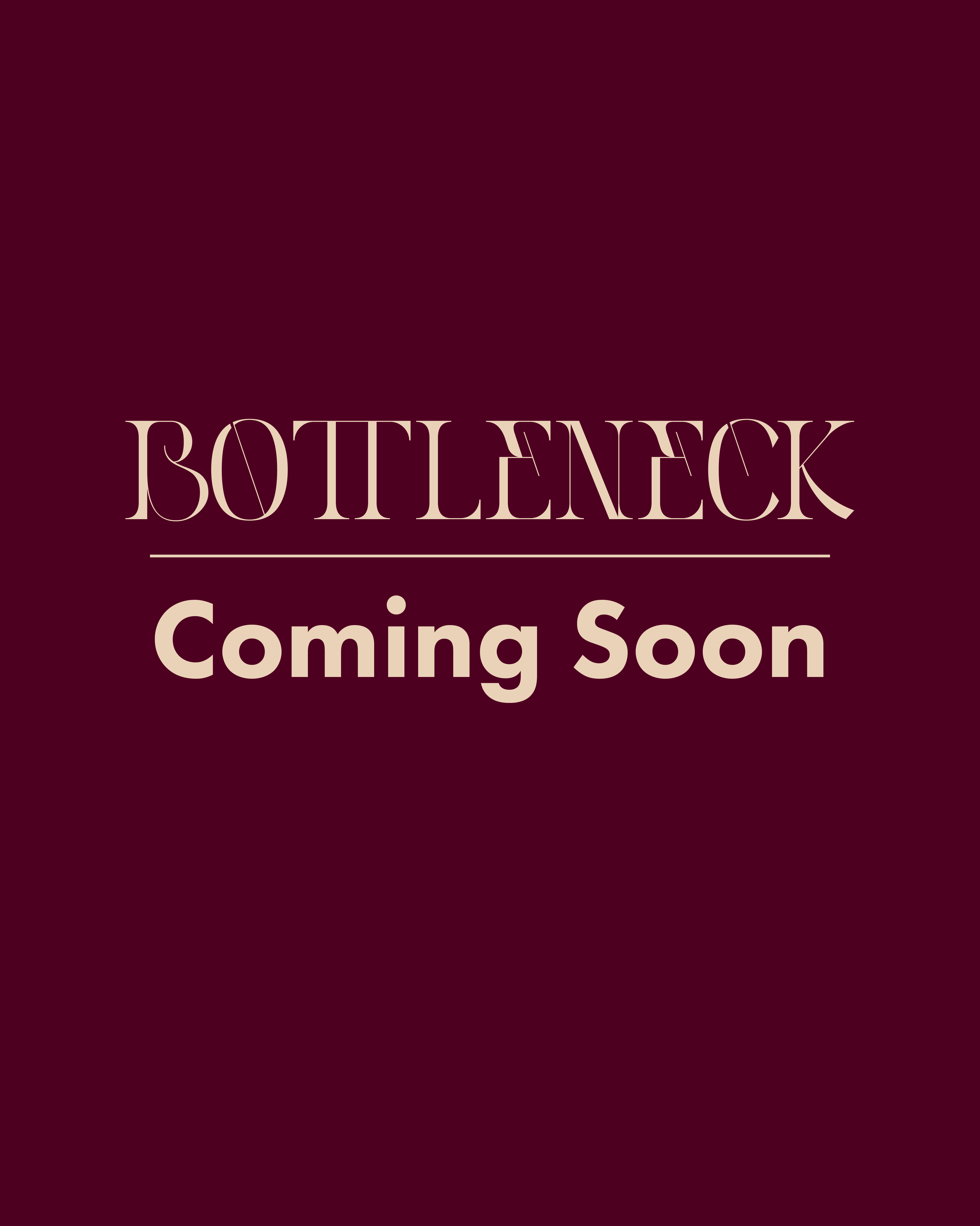
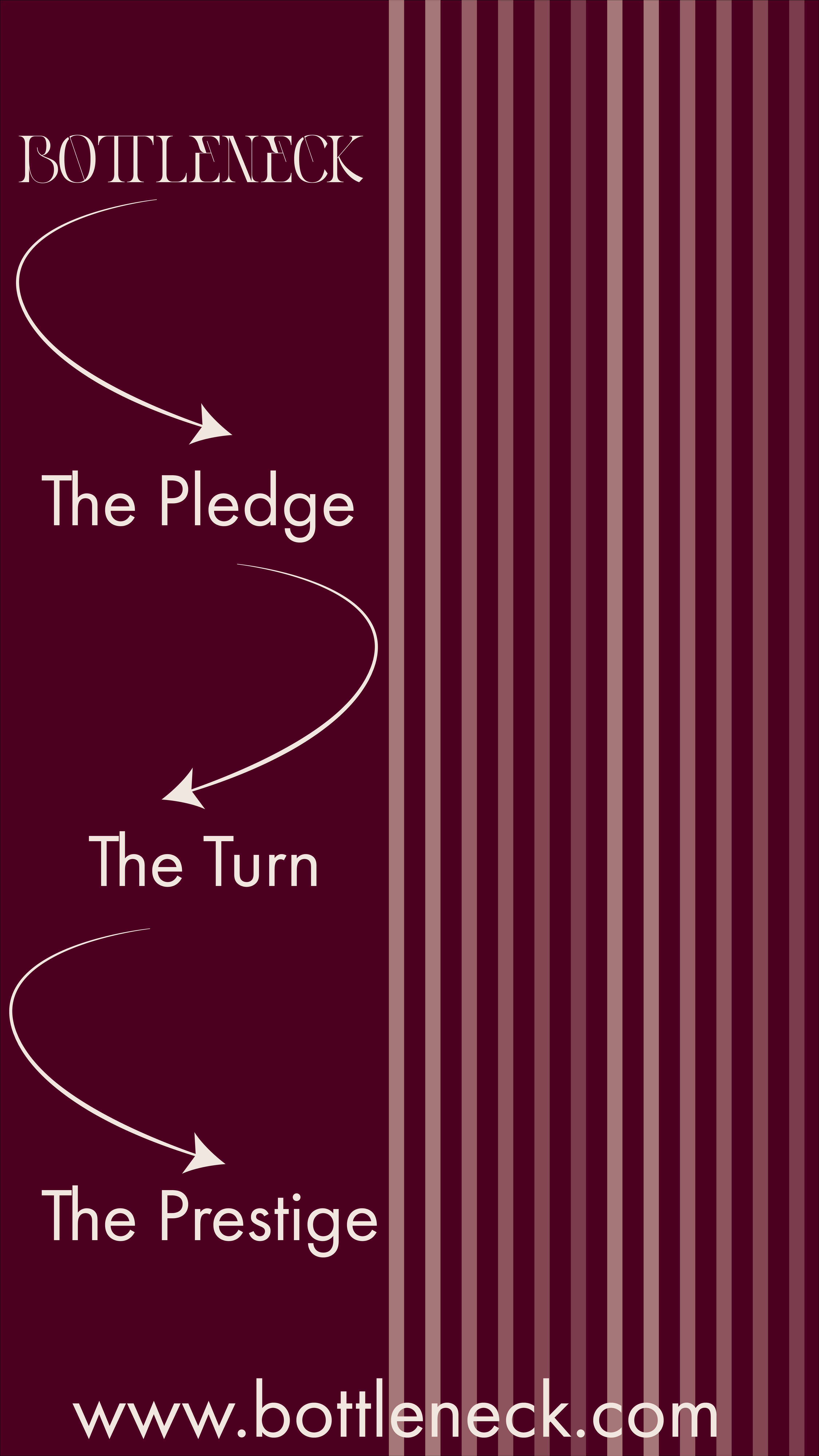
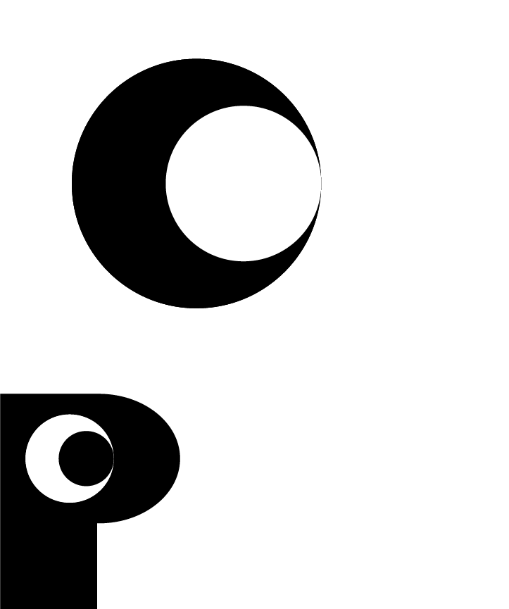
Bottleneck’s identity centers on a literal, 90s-inspired logo that combines “bottle” and “neck” into a clear wine-focused symbol. A rich violet palette and elegant typography create a refined visual language, supported by strong label mockups and social content that balances luxury with approachability.
Bottleneck Wine
Graphic Design
October 29, 2025

For Bottleneck, I developed a complete brand identity rooted in a literal interpretation of the brand name—combining “bottle” and “neck” into a logo system that clearly reflects a modern wine company. The goal was to design an identity that feels like it could have originated in the 90s yet remains relevant and refined today.
The identity was designed to:
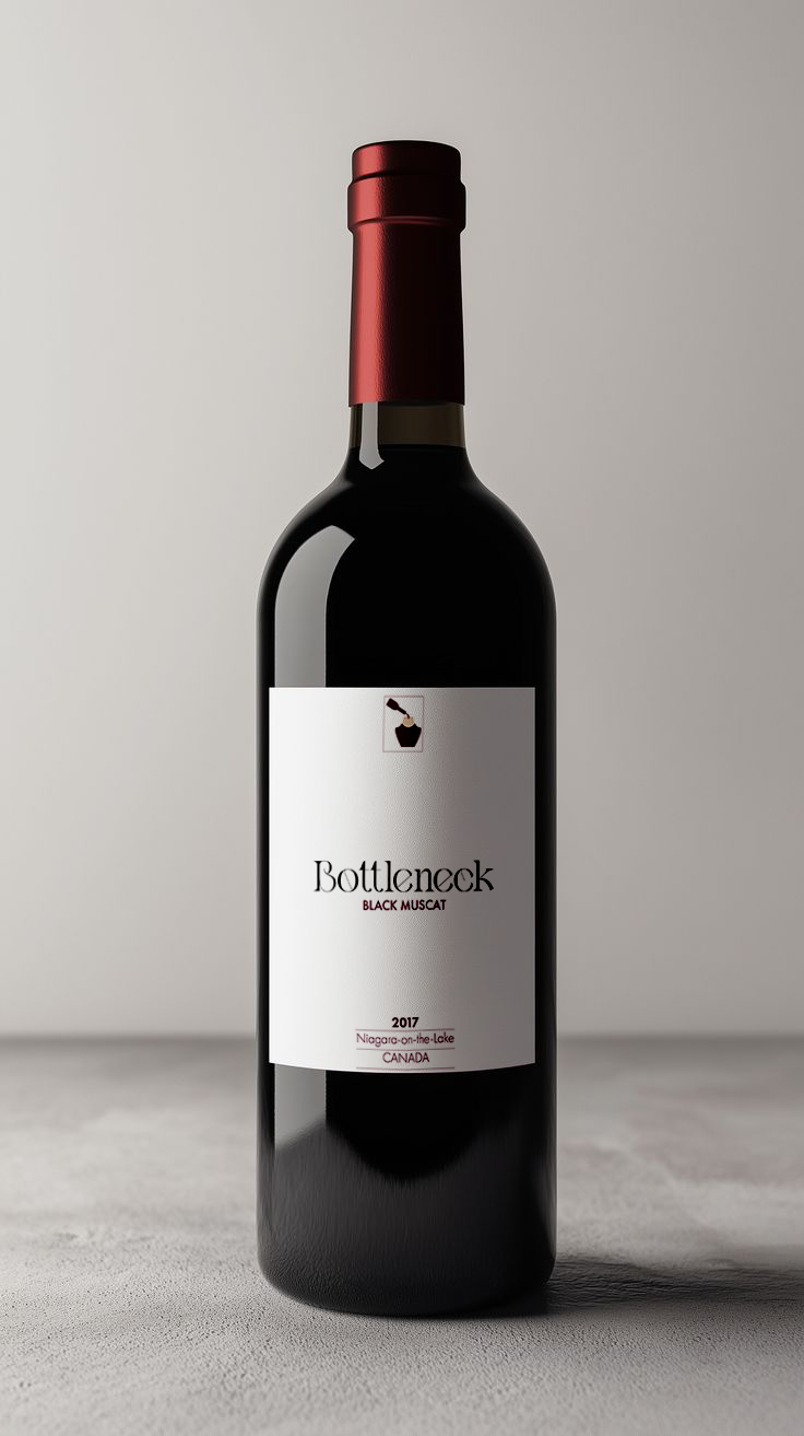
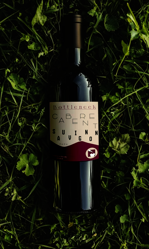
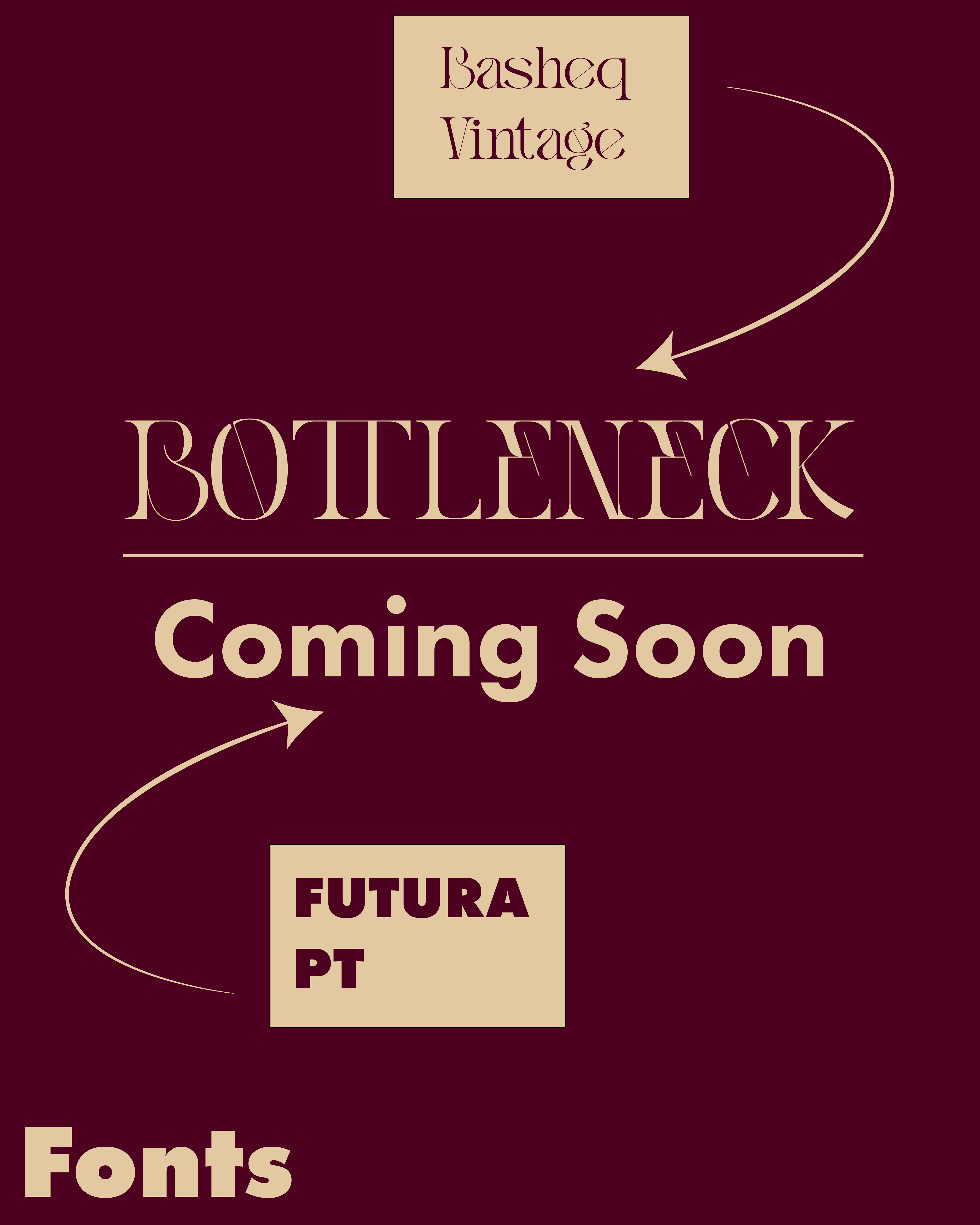
The logo visually represents both a bottle and a neck, directly tying into the brand’s name. It avoids abstraction in favor of clarity, making the identity immediately understandable. The aesthetic carries a subtle 90s influence, giving it character while maintaining modern relevance.
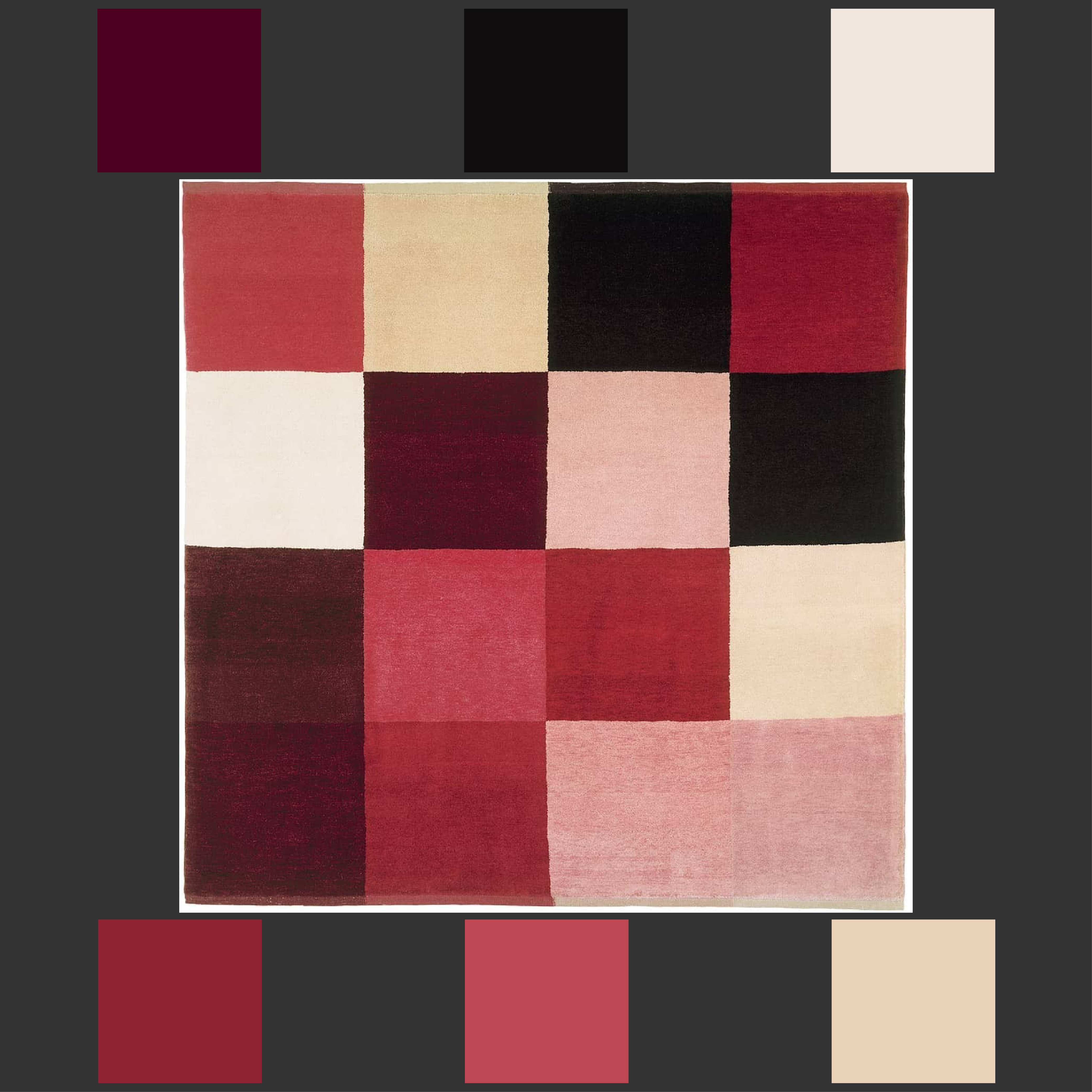
The primary color is violet, symbolizing wine, grapes, richness, and royalty. This tone—combined with black, vanilla, and off-white—creates a palette that is both striking and sophisticated. The contrasts strengthen the brand’s visual impact.
Four label variations demonstrate how the logo and typography translate onto wine bottles, highlighting scalability, clarity, and aesthetic cohesion.
The social content communicates luxury without excessive flashiness, striking a balance between exclusivity and approachability. The visuals position Bottleneck as a premium brand that still feels friendly, warm, and accessible.


A good design can never become obsolete.
© 2025 Puls Design. All Rights Reserved.
Built By
Philip Puls